Continental Divide – Splitting Regions Map

Frequent ways of dividing large areas of land in the United States, or across the world, is by grouping them into regions according to their geographic position on the continent. Perhaps, the Northeast, Southwest, West, Southeast, or Midwest. Another, is to split the areas of land, such as with continental divide maps.

Continental Divides in North America.
Map: Wikipedia

A continental divide is a natural (i.e. not man-made) boundary separating precipitation. Essentially, rivers, rainfall, snowfall, etc., water that flows into two oceans. Therefore, divides are the barriers that prevent rivers, etc on one side from flowing into oceans on the other.

Next, we see still another example when we look at state boundaries. Splitting areas of land, like with the continental divide trail map, can be extremely useful.

Perhaps you would like to make a map visualizing regions or splits, such as those with geographic position or continental divide map.

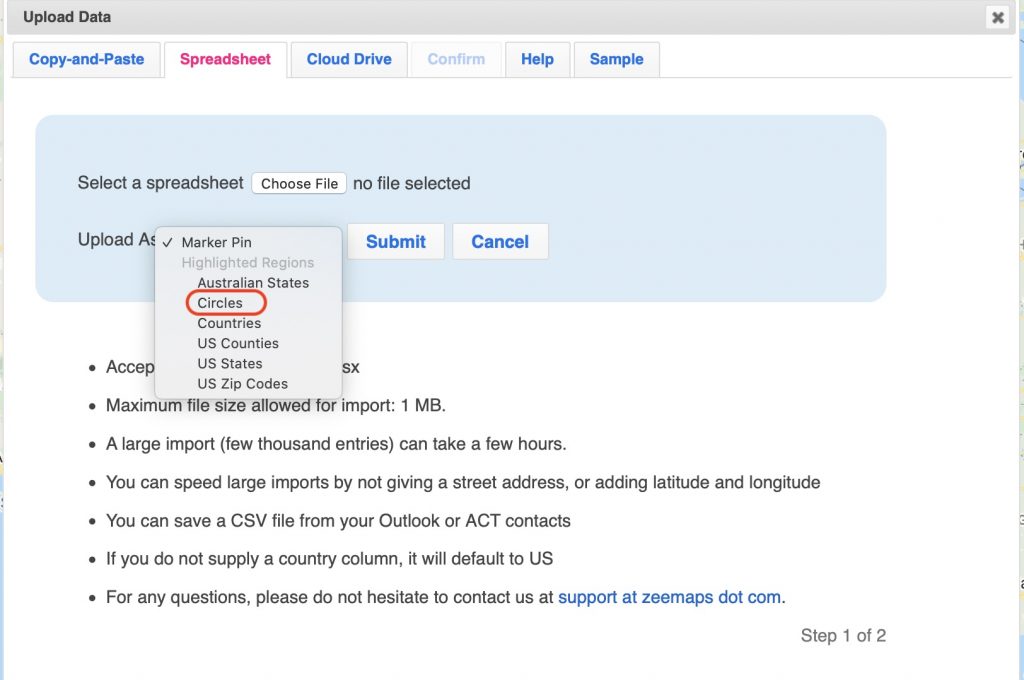
Here we show how to split regions within ZeeMaps.


Split a region in three steps:

Divide continents, regions, or any other map boundary!

Step 1: Select the region. For large regions, as with continental divide or region maps, the setup for this might take a while, as we change the entire boundary to be editable.

Select the region. For large regions, such as continental divide, the setup for this might take a while, as we change the entire boundary to be editable.

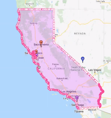
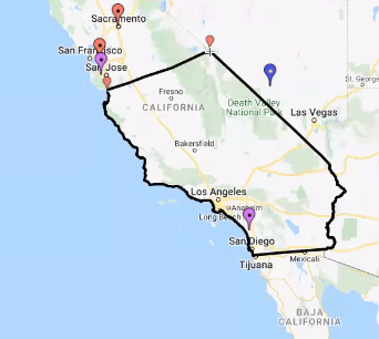
Step 2: Next, mark the vertices for the start and end of the split on the selected region

Next, mark the vertices for the start and end of the split on the selected region, or continental divide

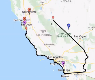
Step 3: Last, connect the split vertices by a new polyline edge

connect the split vertices by a new polyline edge

For connecting the two vertices with a new edge, start by a single click and then click for each step. At the final step do a double-click. Use the Select button to initiate the first step.

connect the split vertices by a new polyline edge

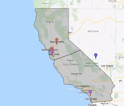
Remember to do the steps in proper sequence. If regions are not grouped, the original highlighted region will be removed.


Connecting Trail Routes or Lines

Design your own Continental Divide Trail Map!

Connecting two markers with a line or route tutorial gives direction on how to create a trial or route, such as those seen in Continental Divide Trail Maps, as show below:

To connect two markers with a route or trail between them, please do the following:

  1. Click on the first marker to open its information balloon.
  2. Click on the third icon of the four icons to the right bottom of the information balloon. You must have unlocked the map as Map Admin for the icons to show.
  3. This should result in a dialog box for the connection. Customize your connection, e.g., whether it is a route or straight line, etc.
  4. Click on the second marker for the connection.
  5. Hit Submit.

For connecting another set of two markers, please close the connection dialog and repeat steps 1 through 5.


Finally, we challenge you to create your own continental divide trail, re-write the map! How to you think regions should be split, what trail looks like a great hike? Use your imagination and be creative!

Don’t forget to tag @zeemaps in your social media posts!

Create a map with expiring map pins for your online map. Upload a spreadsheet with an expiry column, or set a expiry date on individual map pins.

Map Pin with Expiry Dates for Online Maps

ZeeMaps allows you to create maps with different colored markers, in different colors, shapes, and sizes. You can also upload your own image to replace the standard map pins offered through ZeeMaps. Sometimes, however, we want to mark locations on maps that have a deadline associated with them, for example, a service may be available on a certain location only for the next few days, or an event is happening on a location for a specific date.

Until now, you would manually remove these markers from maps once the date for which they were valid had expired. Not anymore!

Setting Expiration for Map Pin

ZeeMaps now allows you to specify expiry for markers on your online map. You can specify the expiry of your marker in one of the following two ways:

1. When uploading markers through spreadsheets, add a column called Expires. In the column you can specify the number of days until the marker for that row should stay on the map. The pin will expire after the number of days has elapsed when the map pin was added.

2. After adding a map pin, you can double-click on it to make changes to it. In the resulting dialog, use the Admin tab to enter a date when that particular marker will expire.

Since ZeeMap allows markers to be pins or highlighted areas on map, e.g., circles or zip codes, this feature will work for both map pins and highlighted areas.

Adding an Expires column to spreadsheet uploads

When you upload a spreadsheet, for example a Microsoft Excel file or a CSV (Comma Separated Values) file and hit submit, there is a confirmation step when we assign columns to designated map fields. The dialog below illustrates this confirmation step:

Confirm column mappings for Las Vegas zip codes upload
Confiirmation step for Spreadsheet uploads

If you click on the Advanced tab, there will be a column assignment for the Expires field. Make sure that the column in which you have the expires values for your map pin is assigned correctly in this tab.

Column assignment for the Expires column

Adding an Expires values by editing a map pin

When you edit a map marker, by double-clicking on it or by clicking on the name in the information bubble, you get an edit dialog:

Dialog for editing a map pin on ZeeMaps

Go to the Admin tab within the edit dialog. If you have a paid plan with ZeeMaps, you can find the Expires setting for this map marker in the Admin tab: Select the Expire date.

Add an expiry date to a map pin on ZeeMaps
A radius map showing UK office locations and their reach

Radius map: Upload circles on a map from spreadsheets

We thought it was time to add the function to upload a radius map. ZeeMaps allows you to upload spreadsheets with pins, or with highlighted geographical areas like US zip codes or counties. Now you can highlight circles on the map with different radii, using spreadsheet uploads.

To upload a spreadsheet of data as circles, add a column called ‘Radius’ to your spreadsheet. Specify the radius in miles or kilometers for each of the rows. On rows where you do not have a radius specified, you can define a default radius. Therefore, if you want all your circles to be of the same radius, you do not need to create a radius column – just specify a default radius.

How to upload a spreadsheet to create a radius map

To get started uploading a spreadsheet with circle markers, you can do one of two things:

  1. Select the ‘Additions’ > ‘Add (Upload) Multiple Markers’ menu item on your map, or
  2. Click the ‘Map My Spreadsheet’ button.

You will be presented with a dialog to pick a file to upload. Along with the file, there is an option to specify what kind of markers you would like to add. Make sure you select the option that says ‘Circles’, as below.

This image shows the upload data page and how to upload as circles.
Select the option to upload circles on a map

After you have selected a file and hit submit, the next dialog will give you the option to select your radius column, choose the default radius, and select whether the radius values are in miles or kilometers. Even if you are not using the default radius, and have specified radius values for each of your spreadsheet rows, make sure you check the appropriate box for miles or kilometers, depending on how your radius values are specified.

This image shows the default radius option and also the circle radius column.
Circle radius column and default radius

Just like any other spreadsheet upload, the circle markers can have different colors and additional information in them that will be visible once you click on the circle.

The benefits of circle markers

Circle markers can be helpful if you have multiple service persons and jobs spread throughout a geographical area. They can help you to quickly understand which service person to assign to which job, depending on distances.

US state map using extended colors

We encourage you to read this blog post fully, as there is a link to a free US State Map at the end!
ZeeMaps has more than doubled the colors available to users with an Enterprise Plan. It means you can group markers into 75 different colors instead of just 32. This comes in handy when you are coloring a US state map, or other maps with multiple regions. The six palettes contain shades from teal to princess perfume, sunglow to cyber grape.
You can view the different color palettes in the tabs at the top of this page. All ZeeMaps users have access to the Classic palette. Only users who have signed up for the Enterprise plan have access to the next five palettes (Red; Yellow-Orange; Green; Blue; and Violet).

Color your US state map with extended color palettes

Use the extended palette on your US state map

To use the extended palette, you must set it up for each map. How? Go to Map > Settings and select the ‘Markers Display’ tab. Set the option for ‘Use Extended 75 Colors’ and hit ‘Save Changes.’ This will enable you to see the extended colors on that particular map.
For additions, go to Additions > Add Marker (Simple) or Add Marker (Detailed). Whether you select Simple or Detailed, both will show the color options based on the map settings. With extended colors, you’ll be able to chose from among 75 colors.

Upload a spreadsheet with multiple colors

To upload a spreadsheet with multiple colors, set a column for ‘Color’ or ‘Category’ on your spreadsheet. If you use ‘Color’, choose the color names listed on this page. If you set a column for ‘Category’, you can specify different values in the rows and ZeeMaps will assign a different color to each different value –  starting with the shade that you select for ‘Default Color.’ Once you have finished your spreadsheet, go to Additions > Add (Upload) Multiple Markers.
As an illustration, we will use the following spreadsheet to create a multi-colored US state map:

Spreadsheet for US State Map
Spreadsheet for US state map

US State Map with 50 Colors

Based on a well known mathematical four color theorem, you need only four different colors for coloring a map, in order that no two adjacent regions have the same color. Although it is technically feasible to limit ourselves to four colors, that is not necessarily appealing  – especially if different shades are used to indicate variations in some indicator, e.g., population density. Here’s an interactive map that we created with 50 colors for US states.

You can use the ZeeMaps Print or Share capability to get an image of your map. In the Print or Share menu, select the option for PDF/PNG Image. In the resulting dialog, use the setting ‘US Map’ for Geography and make sure it is a ‘Simple’ US map and not a ‘Colored’ one.

US State Map
US state map with extended colors

We are giving away a high-resolution poster-sized image of this US state map, so if you like what you see you can download it here for free. This image was created with ZeeMaps, by setting the size of the image to poster and resolution to 300 DPI.
We hope you enjoy using your more colorful ZeeMaps!


Counties: Map with Name or FIPS code

ZeeMaps provides easy mechanisms to highlight various geographies (e.g., countries, states, cities, zip codes) and geometries (polygons, circles) on a map. These highlighted areas or “regions” are helpful in marking out territories or service areas. One of the areas that is specially useful to highlight is US Counties, a first level administrative sub-division in the United States after the state. County boundaries can be useful to analyze customer or sales data.
ZeeMaps allows you to highlight counties in two ways:

  1. You can highlight a county one at a time, using the Additions -> Highlight Regions -> Counties on your map, and
  2. Upload a list of counties contained in an Excel spreadsheet or CSV file, using the Additions -> Add (Upload) Multiple markers menu item on your map.

The second option is helpful if you have hundreds or thousands of counties to highlight. This blog post reports on a new development for the second option of highlighting counties.

Improving the user experience

We are always looking for ways to improve the user experience – whether we are implementing changes we think would be useful or responding to feedback from our users. We are constantly working to improve existing user functions and to add new ones. That’s why we’ve been busy making US counties easier to work with.
One of the improvements has made highlighting US counties through spreadsheet upload far easier. Users can use a county name or FIPS code instead of specifying an address.

Highlight the top 10 and lowest populated Counties in the US

Previously, users had to specify an address or location to highlight a county. Let’s use our office in Cupertino, CA, Santa Clara, as an example. Earlier, we’d need a column for ‘City’ and ‘State’, or Zip Code in our spreadsheet, to identify a location within the county. So, even if you knew the county name, in this case Santa Clara, it was not usable. You had to figure out a location within the county and use that as input to identify the Santa Clara county, instead of giving its name. Now it’s possible to:

  • have a column called ‘County’ and specify ‘Santa Clara’, or
  • use ‘06085’ – the FIPS code for Santa Clara county

In the rest of this post, we’ll use the following map as an example. The purple colored counties are the ten most populated counties in the US, and the orange ones are the least. You can click on a highlighted county to get the population for that county and its name.

Formatting your spreadsheet

The following table shows the spreadsheet that we used to create this map. It contains five columns: County, State, Color, Population, and County Name. Here’s a bit more about them:

  1. County: we use this column to identify the county to be highlighted.
  2. State: we use this column to disambiguate counties with the same name. If you are using just FIPS codes, or if your county names are unique, then this may not be necessary.
  3. Color: we use this column for the color of the highlighted area. ZeeMaps supports up to 32 different colors for most users, and up to 75 colors for our Enterprise users. A complete list of supported colors can be found on our Colors page.
  4. Population: The last two columns will be used as information to be shown when a user clicks on one of the highlighted county regions. Since this spreadsheet is for the ten most and ten least populated counties in the US, we show the population count from a 2017 estimate.
  5. County Name: we use this column so that some of the counties that have the FIPS code can be easily identified by a regular user who may or may not be aware of FIPS codes.

Counties spreadsheet

You’ll see that the ‘County’ column (A) mixes county names and FIPS codes. To show the county name in the information bubble, there is a ‘County Name’ column (E) as well.

Uploading your spreadsheet

To upload your spreadsheet, open your map and select Additions > Add (Upload) Multiple Markers. In the dialog box that follows, select the ‘US Counties’ option for Upload As.

Counties spreadsheet upload - step 1
Counties spreadsheet upload – step 1

Then, submit your spreadsheet. ZeeMaps will read your spreadsheet and make an initial pass at understanding which column to use for what information, based on the column names that you specified in the spreadsheet. Double-check the column assignments in the confirmation step and make any changes as necessary. In the following image, we have highlighted some of the assignments that needed adjustments for this spreadsheet:
Counties spreadsheet upload - step 2
Counties spreadsheet upload – step 2

If you have any suggestions for improvements to ZeeMaps, please get in touch.