Graduated, Data-Driven Colors for Your Pins and Regions
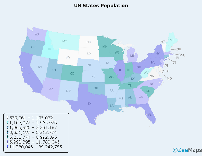
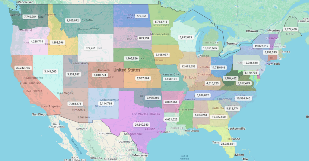
A spreadsheet full of numbers rarely tells a story. A color map by data values tells it instantly. With ZeeMaps’ […]
A spreadsheet full of numbers rarely tells a story. A color map by data values tells it instantly. With ZeeMaps’ […]
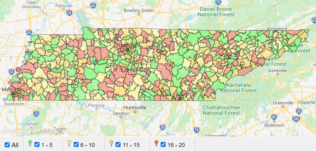
ZeeMaps supports highlighting regions on maps, making it easy to visualize sales territories, service areas, or marketing reach. Highlighted areas are
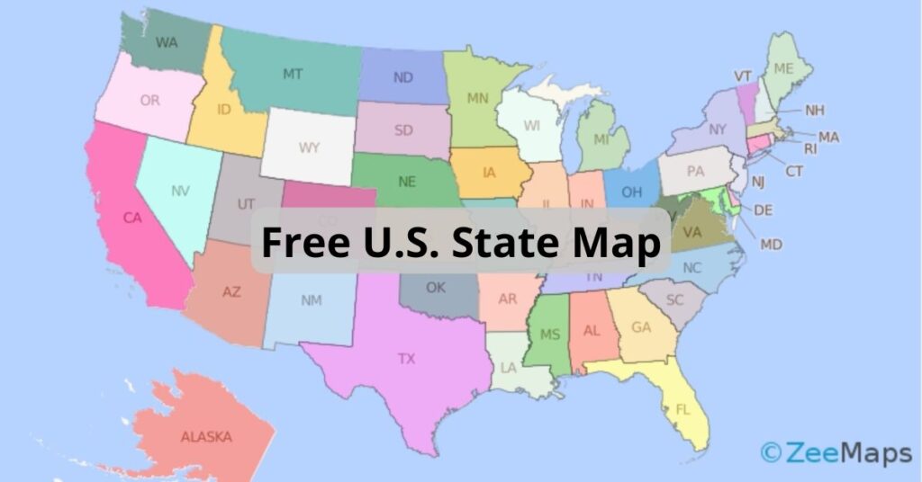
ZeeMaps has more than doubled the colors available to users with an Enterprise Plan. Download this free U.S. state map to use them all.
You can use the IFS function in Excel to assign different colors to pins or highlighted regions in ZeeMaps.

Splitting regions on a map, like by using the continental divide, can be extremely useful. Make a map visualizing regions or splits.
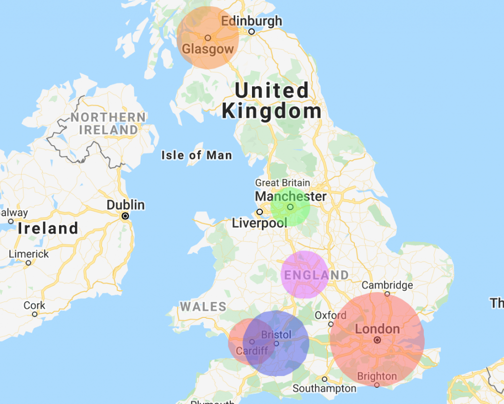
We thought it was time to add the function to upload a radius map. ZeeMaps allows you to upload spreadsheets