US state map using extended colors

We encourage you to read this blog post fully, as there is a link to a free US State Map at the end!
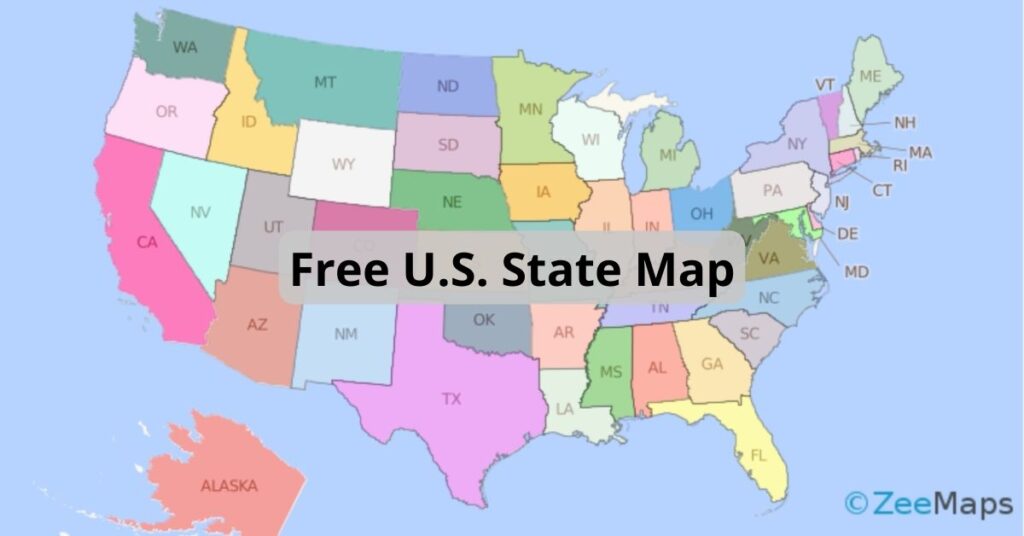
ZeeMaps has more than doubled the colors available to users with an Enterprise Plan. It means you can group markers into 75 different colors instead of just 32. This comes in handy when you are coloring a US state map, or other maps with multiple regions. The six palettes contain shades from teal to princess perfume, sunglow to cyber grape.
You can view the different color palettes in the tabs at the top of this page. All ZeeMaps users have access to the Classic palette. Only users who have signed up for the Enterprise plan have access to the next five palettes (Red; Yellow-Orange; Green; Blue; and Violet).

Color your US state map with extended color palettes

Use the extended palette on your US state map

To use the extended palette, you must set it up for each map. How? Go to Map > Settings and select the ‘Markers Display’ tab. Set the option for ‘Use Extended 75 Colors’ and hit ‘Save Changes.’ This will enable you to see the extended colors on that particular map.
For additions, go to Additions > Add Marker (Simple) or Add Marker (Detailed). Whether you select Simple or Detailed, both will show the color options based on the map settings. With extended colors, you’ll be able to chose from among 75 colors.

Upload a spreadsheet with multiple colors

To upload a spreadsheet with multiple colors, set a column for ‘Color’ or ‘Category’ on your spreadsheet. If you use ‘Color’, choose the color names listed on this page. If you set a column for ‘Category’, you can specify different values in the rows and ZeeMaps will assign a different color to each different value –  starting with the shade that you select for ‘Default Color.’ Once you have finished your spreadsheet, go to Additions > Add (Upload) Multiple Markers.
As an illustration, we will use the following spreadsheet to create a multi-colored US state map:

Spreadsheet for US State Map
Spreadsheet for US state map

US State Map with 50 Colors

Based on a well known mathematical four color theorem, you need only four different colors for coloring a map, in order that no two adjacent regions have the same color. Although it is technically feasible to limit ourselves to four colors, that is not necessarily appealing  – especially if different shades are used to indicate variations in some indicator, e.g., population density. Here’s an interactive map that we created with 50 colors for US states.

You can use the ZeeMaps Print or Share capability to get an image of your map. In the Print or Share menu, select the option for PDF/PNG Image. In the resulting dialog, use the setting ‘US Map’ for Geography and make sure it is a ‘Simple’ US map and not a ‘Colored’ one.

US State Map
US state map with extended colors

We are giving away a high-resolution poster-sized image of this US state map, so if you like what you see you can download it here for free. This image was created with ZeeMaps, by setting the size of the image to poster and resolution to 300 DPI.
We hope you enjoy using your more colorful ZeeMaps!


Counties: Map with Name or FIPS code

ZeeMaps provides easy mechanisms to highlight various geographies (e.g., countries, states, cities, zip codes) and geometries (polygons, circles) on a map. These highlighted areas or “regions” are helpful in marking out territories or service areas. One of the areas that is specially useful to highlight is US Counties, a first level administrative sub-division in the United States after the state. County boundaries can be useful to analyze customer or sales data.
ZeeMaps allows you to highlight counties in two ways:

  1. You can highlight a county one at a time, using the Additions -> Highlight Regions -> Counties on your map, and
  2. Upload a list of counties contained in an Excel spreadsheet or CSV file, using the Additions -> Add (Upload) Multiple markers menu item on your map.

The second option is helpful if you have hundreds or thousands of counties to highlight. This blog post reports on a new development for the second option of highlighting counties.

Improving the user experience

We are always looking for ways to improve the user experience – whether we are implementing changes we think would be useful or responding to feedback from our users. We are constantly working to improve existing user functions and to add new ones. That’s why we’ve been busy making US counties easier to work with.
One of the improvements has made highlighting US counties through spreadsheet upload far easier. Users can use a county name or FIPS code instead of specifying an address.

Highlight the top 10 and lowest populated Counties in the US

Previously, users had to specify an address or location to highlight a county. Let’s use our office in Cupertino, CA, Santa Clara, as an example. Earlier, we’d need a column for ‘City’ and ‘State’, or Zip Code in our spreadsheet, to identify a location within the county. So, even if you knew the county name, in this case Santa Clara, it was not usable. You had to figure out a location within the county and use that as input to identify the Santa Clara county, instead of giving its name. Now it’s possible to:

  • have a column called ‘County’ and specify ‘Santa Clara’, or
  • use ‘06085’ – the FIPS code for Santa Clara county

In the rest of this post, we’ll use the following map as an example. The purple colored counties are the ten most populated counties in the US, and the orange ones are the least. You can click on a highlighted county to get the population for that county and its name.

Formatting your spreadsheet

The following table shows the spreadsheet that we used to create this map. It contains five columns: County, State, Color, Population, and County Name. Here’s a bit more about them:

  1. County: we use this column to identify the county to be highlighted.
  2. State: we use this column to disambiguate counties with the same name. If you are using just FIPS codes, or if your county names are unique, then this may not be necessary.
  3. Color: we use this column for the color of the highlighted area. ZeeMaps supports up to 32 different colors for most users, and up to 75 colors for our Enterprise users. A complete list of supported colors can be found on our Colors page.
  4. Population: The last two columns will be used as information to be shown when a user clicks on one of the highlighted county regions. Since this spreadsheet is for the ten most and ten least populated counties in the US, we show the population count from a 2017 estimate.
  5. County Name: we use this column so that some of the counties that have the FIPS code can be easily identified by a regular user who may or may not be aware of FIPS codes.

Counties spreadsheet

You’ll see that the ‘County’ column (A) mixes county names and FIPS codes. To show the county name in the information bubble, there is a ‘County Name’ column (E) as well.

Uploading your spreadsheet

To upload your spreadsheet, open your map and select Additions > Add (Upload) Multiple Markers. In the dialog box that follows, select the ‘US Counties’ option for Upload As.

Counties spreadsheet upload - step 1
Counties spreadsheet upload – step 1

Then, submit your spreadsheet. ZeeMaps will read your spreadsheet and make an initial pass at understanding which column to use for what information, based on the column names that you specified in the spreadsheet. Double-check the column assignments in the confirmation step and make any changes as necessary. In the following image, we have highlighted some of the assignments that needed adjustments for this spreadsheet:
Counties spreadsheet upload - step 2
Counties spreadsheet upload – step 2

If you have any suggestions for improvements to ZeeMaps, please get in touch.

Free maps are changing

When ZeeMaps started out in August of 2005, we wanted to keep things free of charge as much as possible. We’ve done pretty well with this, but the time has come where we have no choice but to make some changes. We have grown and there are thousands of maps being created each day. Whilst this is great news, it makes it impractical for us to keep offering a free service when we have to pay for the maps on a per-visit basis. That’s why we are changing the way in which our free maps can be viewed.

100 views on free maps

Therefore, as of 1st April 2018, ZeeMaps will limit the number of views on free maps to 100. (Free maps means maps that are not owned by an active paid plan). When you reach 100 views, your map will ‘freeze’ and it can only be unfrozen by upgrading to a paid subscription plan.

How to upgrade your account 

If you are currently on the Basic (free) plan and want uninterrupted service, please upgrade to a paid plan before April 1st. To upgrade your account, first click the ‘Sign-In’ link on the top right of the homepage and enter your login information. Next, click on your name/email in the top right-hand corner and select ‘Account’.

Free Maps Account Management

 
The tabs at the top of your account page allow you to manage and upgrade your subscriptions; manage users; and manage the cards you use to pay – among other things.
If you created a free map without registering, you’ll have to Sign-Up in order to upgrade your account. Select the ‘Sign-Up’ link on the top right of the homepage to get started, then follow the instructions from there.
Contact us if you have any questions or need any assistance – we’re always happy to help. And thanks for your patience and understanding.

Location Map: Change multiple markers at once

ZeeMaps allows you to add simple or detailed markers to a location map. You can do this individually, or in bulk by uploading a list of locations from a spreadsheet or table. One of our newest features allows you to change multiple markers at once, which makes editing multiple locations much quicker. And do you want to know the best bit? You don’t need a paid subscription to access this feature. That’s right – it’s free!

Select Markers on your Location Map

It’s simple to change multiple markers at the same time on your location map. Select ‘Bulk Edits’ then ‘Change Some Markers’ from your map menu. A dialog box will ask you to select a set of markers (including regions) by dragging your mouse over the map. This allows you to draw a box around your markers. You can reposition the box until you’re happy you’ve included all the markers you want.

Select a set of markers on your location Map
Select a set of markers on your location map

Change multiple markers on your location map

Once you have selected your markers, you can edit them all in one place. The dialog box allows you to change the marker color from the dropdown list. You can also choose to add a description, an email address, a phone number or a website to all the selected markers. If you don’t want any information included, just leave the dialogue boxes empty here. Make sure you hit ‘Submit’ to see the changes appear on your map.

Change some markers
Change some markers

Time is money

Not only  this feature mean you can keep your map entries consistent, it also allows users to work far more quickly and effectively. We’ve had some feedback that it’s really useful for people organising garage sales, yard sales or even estate sales. It saves people so much time. We hope you will find it useful too.

HIPAA compliance maps easily built using ZeeMaps

We take security measures very seriously here at ZeeMaps. As a result, we are happy to report that we are HIPAA compliant.


HIPPA stands for Health Insurance Portability and Accountability Act. Which started in 1996. It includes measures to protect patient health data. Consequently, it affects any company that deals with protected health information (PHI). Therefore, they must make sure that physical, network, and process security measures are adhered to.

We meet HIPAA requirements

ZeeMaps is HIPAA compliant. So what does this mean for our users? Essentially, all it means you can rest assured that your data is completely secure.

For example, all user information and data are stored encrypted on a database. Therefore, data are not stolen or leaked. We use one of the strongest block ciphers available to encrypt data.

In addition, multi-factor authentication provides an extra layer of security.
The diagram below shows our infrastructure design. The diagram illustrates secure traffic flow from users to the ZeeMaps environment. This traffic flow helps to endure HIPAA compliance.

HIPAA compliant ZeeMaps secure infrastructure
HIPAA Compliant ZeeMaps secure infrastructure

HIPAA Patient-Provider Maps

You can use the secure ZeeMaps infrastructure to create patient-provider maps. First, create a spreadsheet of all your patient and provider locations. Next, add a column to the spreadsheet called Category. For values, you could enter phrases. Such as, “Patient”, “Physical Therapist”, or “Occupational Therapist”, etc.

Next, upload the spreadsheet to you HIPAA map on ZeeMaps.

Now, the map should show all your patients and providers. Including, patients and different kinds of providers colored differently.

Click View > Then, Search Menu

Search for providers within a certain distance of a patient, or an address. Limit the provider types by clicking on the legend at the bottom of the map.

Finally, to export the list of results as a spreadsheet. Use the “Export CSV”. (Found at the bottom of the Search dialog)

Business Associate Agreements

ZeeMaps can sign a Business Associate Agreement (BAA) for anyone who wants to use our service. A BAA is a contract between a HIPAA-covered entity and a business associate. Designed to protect patient health data in accordance with HIPAA guidelines.