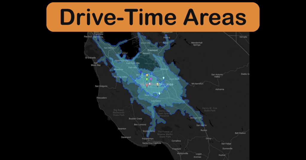
How Far Is 15 Minutes? Introducing Drive-Time Areas
Create an isochrone map in ZeeMaps: highlight drive-time areas around one address, every pin on your map, or a whole spreadsheet of locations.
Create an isochrone map in ZeeMaps: highlight drive-time areas around one address, every pin on your map, or a whole spreadsheet of locations.
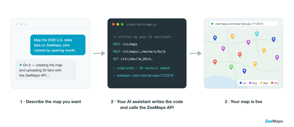
The new ZeeMaps REST API lets your software — or your AI assistant — create maps, add and update markers, search locations, and render map images automatically.
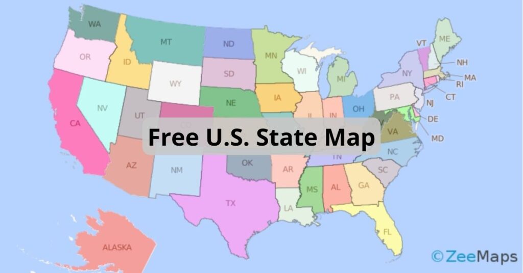
ZeeMaps has more than doubled the colors available to users with an Enterprise Plan. Download this free U.S. state map to use them all.
Use highlighted regions and data uploads in ZeeMaps to conduct quick spatial data aggregation. For example, you can analyze data
When ZeeMaps started out in August of 2005, we wanted to keep things free of charge as much as possible.
If you are a paid user, ZeeMaps allows you to create a traffic map with real-time overlay of Google traffic