A radius map showing UK office locations and their reach

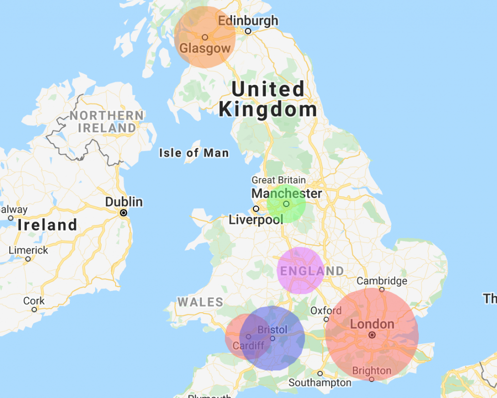
Radius map: Upload circles on a map from spreadsheets

We thought it was time to add the function to upload a radius map. ZeeMaps allows you to upload spreadsheets with pins, or with highlighted geographical areas like US zip codes or counties. Now you can highlight circles on the map with different radii, using spreadsheet uploads.

To upload a spreadsheet of data as circles, add a column called ‘Radius’ to your spreadsheet. Specify the radius in miles or kilometers for each of the rows. On rows where you do not have a radius specified, you can define a default radius. Therefore, if you want all your circles to be of the same radius, you do not need to create a radius column – just specify a default radius.

How to upload a spreadsheet to create a radius map

To get started uploading a spreadsheet with circle markers, you can do one of two things:

  1. Select the ‘Additions’ > ‘Add (Upload) Multiple Markers’ menu item on your map, or
  2. Click the ‘Map My Spreadsheet’ button.

You will be presented with a dialog to pick a file to upload. Along with the file, there is an option to specify what kind of markers you would like to add. Make sure you select the option that says ‘Circles’, as below.

This image shows the upload data page and how to upload as circles.
Select the option to upload circles on a map

After you have selected a file and hit submit, the next dialog will give you the option to select your radius column, choose the default radius, and select whether the radius values are in miles or kilometers. Even if you are not using the default radius, and have specified radius values for each of your spreadsheet rows, make sure you check the appropriate box for miles or kilometers, depending on how your radius values are specified.

This image shows the default radius option and also the circle radius column.
Circle radius column and default radius

Just like any other spreadsheet upload, the circle markers can have different colors and additional information in them that will be visible once you click on the circle.

The benefits of circle markers

Circle markers can be helpful if you have multiple service persons and jobs spread throughout a geographical area. They can help you to quickly understand which service person to assign to which job, depending on distances.

Counties: Map with Name or FIPS code

ZeeMaps provides easy mechanisms to highlight various geographies (e.g., countries, states, cities, zip codes) and geometries (polygons, circles) on a map. These highlighted areas or “regions” are helpful in marking out territories or service areas. One of the areas that is specially useful to highlight is US Counties, a first level administrative sub-division in the United States after the state. County boundaries can be useful to analyze customer or sales data.
ZeeMaps allows you to highlight counties in two ways:

  1. You can highlight a county one at a time, using the Additions -> Highlight Regions -> Counties on your map, and
  2. Upload a list of counties contained in an Excel spreadsheet or CSV file, using the Additions -> Add (Upload) Multiple markers menu item on your map.

The second option is helpful if you have hundreds or thousands of counties to highlight. This blog post reports on a new development for the second option of highlighting counties.

Improving the user experience

We are always looking for ways to improve the user experience – whether we are implementing changes we think would be useful or responding to feedback from our users. We are constantly working to improve existing user functions and to add new ones. That’s why we’ve been busy making US counties easier to work with.
One of the improvements has made highlighting US counties through spreadsheet upload far easier. Users can use a county name or FIPS code instead of specifying an address.

Highlight the top 10 and lowest populated Counties in the US

Previously, users had to specify an address or location to highlight a county. Let’s use our office in Cupertino, CA, Santa Clara, as an example. Earlier, we’d need a column for ‘City’ and ‘State’, or Zip Code in our spreadsheet, to identify a location within the county. So, even if you knew the county name, in this case Santa Clara, it was not usable. You had to figure out a location within the county and use that as input to identify the Santa Clara county, instead of giving its name. Now it’s possible to:

  • have a column called ‘County’ and specify ‘Santa Clara’, or
  • use ‘06085’ – the FIPS code for Santa Clara county

In the rest of this post, we’ll use the following map as an example. The purple colored counties are the ten most populated counties in the US, and the orange ones are the least. You can click on a highlighted county to get the population for that county and its name.

Formatting your spreadsheet

The following table shows the spreadsheet that we used to create this map. It contains five columns: County, State, Color, Population, and County Name. Here’s a bit more about them:

  1. County: we use this column to identify the county to be highlighted.
  2. State: we use this column to disambiguate counties with the same name. If you are using just FIPS codes, or if your county names are unique, then this may not be necessary.
  3. Color: we use this column for the color of the highlighted area. ZeeMaps supports up to 32 different colors for most users, and up to 75 colors for our Enterprise users. A complete list of supported colors can be found on our Colors page.
  4. Population: The last two columns will be used as information to be shown when a user clicks on one of the highlighted county regions. Since this spreadsheet is for the ten most and ten least populated counties in the US, we show the population count from a 2017 estimate.
  5. County Name: we use this column so that some of the counties that have the FIPS code can be easily identified by a regular user who may or may not be aware of FIPS codes.

Counties spreadsheet

You’ll see that the ‘County’ column (A) mixes county names and FIPS codes. To show the county name in the information bubble, there is a ‘County Name’ column (E) as well.

Uploading your spreadsheet

To upload your spreadsheet, open your map and select Additions > Add (Upload) Multiple Markers. In the dialog box that follows, select the ‘US Counties’ option for Upload As.

Counties spreadsheet upload - step 1
Counties spreadsheet upload – step 1

Then, submit your spreadsheet. ZeeMaps will read your spreadsheet and make an initial pass at understanding which column to use for what information, based on the column names that you specified in the spreadsheet. Double-check the column assignments in the confirmation step and make any changes as necessary. In the following image, we have highlighted some of the assignments that needed adjustments for this spreadsheet:
Counties spreadsheet upload - step 2
Counties spreadsheet upload – step 2

If you have any suggestions for improvements to ZeeMaps, please get in touch.