Thematic maps are a compelling way to tell a memorable story with data. These highly visual maps are a tool to easily show themes within a geographic region, useful for displaying data points like population, sales leads, climate, and demographics, among other uses.
These types of maps are great for analyzing a specific subject matter and gleaning insights that could help inform business, government, education, and other industries. They serve diverse purposes across fields by visually representing specific spatial themes, and several different kinds of thematic maps are popular for distinct purposes.
What Are Thematic Maps?
Thematic maps are a specialized type of map that communicate specific themes or patterns within a geographical area. Unlike general reference maps, thematic maps use symbols, colors, or patterns to represent data variables. These visual cues allow viewers to quickly see and assess spatial distributions and find relationships between variables.
Commonly used in business, economics, health, and environmental studies, these maps provide insights into population dynamics. Urban planners use them for infrastructure analysis, while educators teach geography and history with thematic maps. Sales representatives find opportunities to increase their market share, while in disaster management, thematic maps help assess natural hazards.
Thematic maps are invaluable tools, aiding decision-makers in understanding patterns, guiding resource allocation, and effectively communicating in a wide array of disciplines.
Ready to start using thematic maps in your profession? These are some of the most common type of thematic maps, and the best uses for them.
Types of Thematic Maps
1. Choropleth Maps
One of the most commonly used thematic maps is the choropleth map. You’ve probably seen them many times before, as they are a great tool for visualizing differences in quantitative data across geographic areas.
Choropleth maps use color shading to differentiate between zones on a map, with each color representing a distinct value. You can use these maps to showcase spatial distribution and highlight regional variations. For example, you might use a choropleth map to show different income levels across a certain state in the U.S. From this map, you can distinguish which geographic regions have the most people who fall into the income bracket your business is targeting.
Other popular uses for this type of map include: displaying population density, income levels, election results, or any data that is more meaningful when compared across regions.
Best used for:
- Demographic information (income, education level, average age, etc.)
- Sales volume within a specific region
- Population information (election results, population density, etc.)
| Advantages | Disadvantages |
| Highly intuitive and easy to synthesize within minutes | Data must be normalized or put on a rate scale so it isn’t misleading |
| Easy to highlight trends and quickly compare data with little to no training | Data aggregation can lead to potential distortion in interpretation |
| Instantly recognizable tool that facilitates effective communication | Lack of context may result in incorrect or biased conclusions |
This map shows the population of each county in the six states in New England, USA. Each color represents a different numerical range.
2. Heat Maps
Heat maps, also known as density maps, depict data with colors or shades to signify levels of intensity or density within a specific region. They use color gradients to show the concentration of values, with warmer colors indicating higher densities or intensities and cooler colors representing lower ones.
Heat maps help identify patterns, trends, and areas of interest by visually highlighting where data points are clustered or distributed. Heat maps are valuable tools for identifying hotspots and making informed decisions based on data visualization.
These thematic maps are commonly used in fields like sales, data analysis, government, and business. You can use heat maps to represent population density, crime rates, sales trends, market penetration, or any data that requires showcasing concentrations or variations across an area.
Best used for:
- Marketing (identify new markets to enter, map market penetration)
- Sales (unlock new opportunities for growth)
- Population density
| Advantages | Disadvantages |
| Easily identify new opportunities within business, sales, and marketing | Not effective for visualizing data with low variance |
| User-friendly, highly intuitive, and easy to read | Improper scaling could lead to inaccurate reading of the map |
| Quick and visually clear insights lead to effective decision-making | Color variations can be subtle, making slight variations in data hard to distinguish |
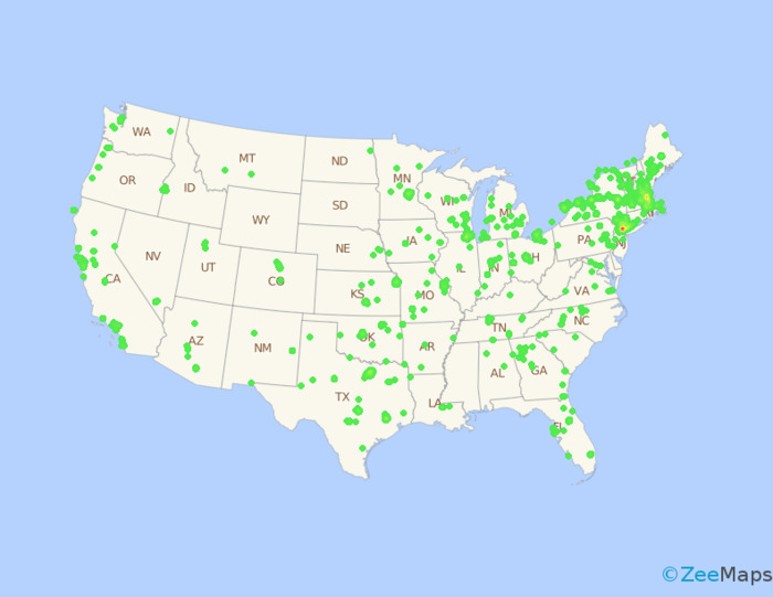
This heat map shows the locations of all the used computer stores in the U.S. You can see from the map that Boston and New York are the most densely populated with stores.
3. Dot Density Maps
Dot density (or dot distribution) maps use dots or other markers to represent the number of times a specific event or phenomenon occurs across a geographic region. Each dot on the map represents a fixed unit of quantity.
For example, one dot could represent 1,000 registered voters. If there are 10,000 registered voters in a region, there would be ten dots concentrated in a small area. Areas with lots of dots signify high amounts of voters, whereas areas with few dots could be good spots for campaigners to focus on, especially if a population map shows that more people than voters live there.
This type of map is suitable for visualizing quantifiable data points, such as the locations of natural disasters, customer hotspots for sales representatives, or the number of stores in a region.
Best used for:
- Geographically-dispersed data (i.e. a large pool of data within a country or large region)
- Binary data (for example, voter or non-voter)
| Advantages | Disadvantages |
| Represent huge data sets in a simple, easy to understand format | Not great for data with a lot of variance |
| User-friendly, highly intuitive, and easy to read | Needs a relatively large data set to be useful |
| Great to use along with other mapping techniques for better insights | Not the best format for displaying information with a lot of nuance |
4. Proportional Symbol Maps
Proportional or graduated symbol maps use symbols or shapes of corresponding sizes to illustrate the quantity or magnitude of a specific variable. By using different-sized circles, squares, or other shapes, these maps offer a quick visual comparison of the data across regions.
A small circle means low concentration of the subject matter, while a large circle indicates more occurrences. If the variable in question, for example, is the number of people in a region with incomes above $80,000 per year, large circles would indicate an area with a lot of people making more than $80,000 per year, while small circles indicates that fewer people in that area have that salary.
Proportional symbol maps are ideal for representing quantitative information like population, sales figures, or any demographic data.
Best used for:
- Demographic data (income, population, gender)
- Sales figures
- Political and governmental analysis of voter opinions
| Advantages | Disadvantages |
| A more simple representation of data that reduces distraction on the map | Smaller differences in size variation may be harder for viewers to perceive |
| Easily highlight magnitude, which has an impact in storytelling | In highly dense areas, symbols may overlap and become hard to read |
| Clear and highly visual, making it user-friendly | Not the best for highly complex and nuanced data |
This proportional symbols map shows another way to look at the population of each county in New England, USA. The larger circles represent more populous counties, while smaller circles are less populous.
5. Cartogram Maps
Cartogram maps are a unique type of thematic map that distort the geographic shapes and sizes of regions to represent a variable, such as population or GDP. By resizing and reshaping regions based on the chosen variable, cartograms provide a compelling and informative representation of data that can have a big impact on viewers.
The intentional distortion of geographic size allows viewers to visualize spatial patterns and relationships that may not be evident in traditional maps. For example, a map of the world could distort countries based on annual GDP, with wealthier countries appearing larger on the map than they are in reality.
Ultimately, cartogram maps are ideal for variables that are best understood in relation to the size or population of a region. They provide a unique perspective on spatial patterns and allow for effective comparisons and analysis of data across different areas.
Best used for:
- Population data
- Economic indicators (average GDP, income, etc)
- Health and environmental statistics
| Advantages | Disadvantages |
| Visually engaging and memorable design | Unique style of the map can lead to confusion |
| Easy to identify disparities and put them into context | Not the best for nuanced data that can’t be solely explained with the given variable |
| High impact maps tell a story, easily emphasizing the importance of looking at the data and finding a solution | Designer must be careful to maintain the integrity of the data without overly distorting it |
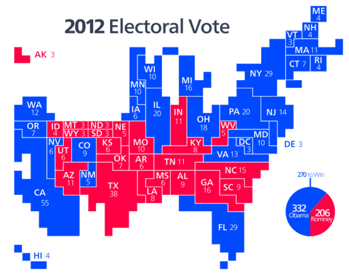
This cartogram map shows the results of the 2012 presidential election. The states are skewed so that their relative size represents the number of electoral votes they have. Source: Wikimedia Commons
Inspired by this map?
Create your own interactive map with ZeeMaps in minutes.