When it comes to data visualization and mapping, choropleth maps stand out as powerful tools for representing spatial patterns and distributions. By using color gradients to represent data values across geographic boundaries, these maps offer insights into data sets ranging from population demographics to economic indicators.
Learn more about what choropleth maps are, their best applications, and the advantages and disadvantages of this type of mapping. We’ll also highlight some examples that you can use to inspire your own creation.
What Is a Choropleth Map?
A choropleth map is a type of thematic map in which areas are shaded using a certain color in proportion to the value of a variable being represented.
Typically, these areas correspond to predefined geographic regions such as countries, states, or counties. The shading intensity or color saturation reflects the magnitude of the variable being measured within each area.
What Are Choropleth Maps Best Used For?
Choropleth maps are best used for visualizing patterns and identifying geographic trends within data sets. They’re particularly effective in highlighting regional disparities, distribution of resources, demographic characteristics, and other data that can be aggregated by geographic boundaries. For example, some of the most common applications include:
- Population Density: Visualizing the distribution of population across regions.
- Economic Indicators: Illustrating income levels, GDP per capita, or housing and unemployment rates by area.
- Health Outcomes: Mapping disease prevalence, healthcare access, or life expectancy.
- Environmental Data: Showing air quality, climate variations, or natural resource distributions.
- Sales and Business Data: Mapping revenue numbers or business leads by sales territory.
How Do Choropleth Maps Use Colors?
The color scheme used in choropleth maps plays a crucial role in communicating information about raw data to viewers. Additionally, map creators will use a gradient scale, where lighter shades or hues represent lower values and darker shades indicate higher values.
The choice of colors is not just aesthetic: it can be critical in ensuring clarity and interpretability while avoiding any potential misinterpretation or bias.
Some common color schemes include nominal, sequential, and diverging schemes, each suited for different types of data and purposes. For example, ColorBrewer is a great resource for choosing an effective color scheme depending on your specific data set to make sure it’s readable.
Advantages and Disadvantages of Choropleth Maps
Advantages:
- Easy Interpretation: Choropleth maps provide a straightforward visual representation of spatial patterns, making it easy for all viewers to interpret, even if they aren’t content experts.
- Effective Communication: They clearly communicate complex data and trends across different geographic areas.
- Comparison: Facilitates comparison between regions, enabling users to identify disparities and trends at a glance.
Disadvantages:
- Data Aggregation: Choropleth maps rely on predefined geographic boundaries. However, this method has the potential to obscure fine-grained variations within regions.
- Sensitivity to Boundary Changes: Alterations in administrative boundaries can affect the interpretation of data.
- Color Selection Bias: Poor color choices or misrepresentation of data through color can lead to misinterpretation or bias.
Examples of Choropleth Maps
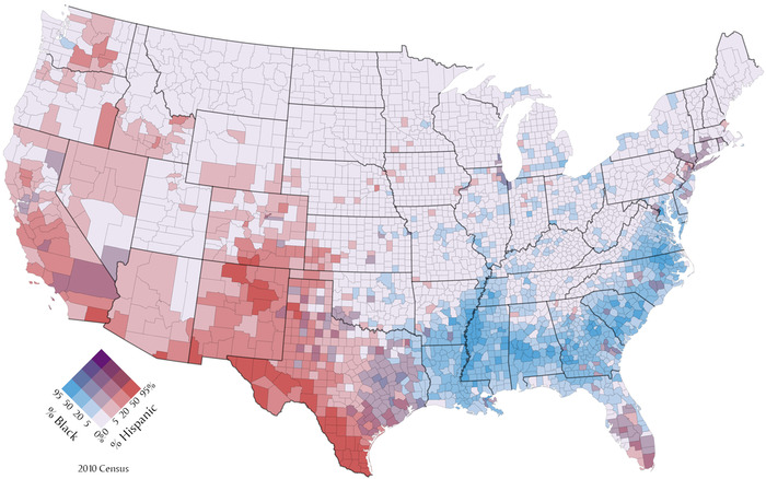
1. US Census Bureau Maps
These maps depict population density, income distribution, and demographic characteristics across states and counties in the United States.
2. Economic Indicators
Major economic players such as the World Bank often utilize choropleth maps to showcase economic data such as GDP growth rates and poverty levels across countries. In the below map, you can see a world map displaying the Human Development Index (HDI) by country. Therefore, lighter shades represent countries with relatively low scores, while darker shades show the most developed countries by this measure.

3. Sales Maps
Businesses can use choropleth maps to visualize their sales territories, identify new opportunities, and then use these insights to make decisions to drive revenue.
Create a Choropleth Map
You can use mapping tools online, including ZeeMaps, to create your own choropleth map to visualize data.
1. Sign up and log in.
To begin creating your choropleth map, visit the ZeeMaps website and sign up for an account if you haven’t already. You can create a new account for free. Once you’ve signed up, log in to your account to access the map creation tools.
2. Start a new map.
Once you log in, navigate to the homepage where you’ll find options to start a new map. Click on the “Create a Map” to begin.
3. Upload your data.
Format your data in an Excel or CSV file, and include a column for color. ZeeMaps has a wide range of color options, making it easy to create a beautiful and effective choropleth map with an effective palette. You can also use conditional formatting (the IFS function) in Excel to easily assign colors to data points based on their value or a range of values.
4. Share and export.
Once you’re satisfied with your creation, you can share your map by exporting it as a PNG or PDF, or you can even embed it into a website using the “Publish in Website” feature that offers up HTML code.
This example map, created using Zeemaps, shows the population of each county in the six states in New England, USA. In this case, each color represents a different numerical range.
Inspired by this map?
Create your own interactive map with ZeeMaps in minutes.