There are tons of different types of maps to choose from to visualize your data, but dot density maps stand out as one of the most popular options. They’re not only a highly effective tool to convey complex data, but they’re also simple and intuitive enough for anyone to understand.
In this guide, we’ll break down the ins and outs of dot density maps by exploring their applications, benefits, and best practices on how to use them.
What Are Dot Density Maps?
Dot density maps are a type of thematic map that we can use to visualize the spatial distribution of a phenomenon across a geographic area. They’re incredibly useful mapping tools because most folks can easily read and understand the maps, without having experience using them.
When studying a particular subject matter, individual dots typically represent a single occurrence within a specific geographic boundary – such as regions, counties, or municipalities. When all the dots come together into one big picture on a map, areas with lots of dots show up as highly concentrated within particular zones. As a result, this offers some insight into the frequency of an occurrence there.
When to Use Dot Density Maps
So when is the best time to use a dot density map over other types of thematic maps? Dot density maps are especially useful for displaying density differences and patterns across a landscape. Essentially, they offer a straightforward way to illustrate where things cluster or spread out within a given area.
Dot density maps come in handy in lots of different fields, including demography, ecology, economics, urban planning, and public health. Here are some examples of the circumstances in which it would make sense to use a dot density map:
- The number of Starbucks stores in a state (where 1 dot = 1 store)
- The number of people who reside in each county (where 1 dot = 1,000 people)
- The number of public schools in a state (where 1 dot = 1 school)
- The number of people who reside somewhere and fit a market profile (where 1 dot = 100 people)
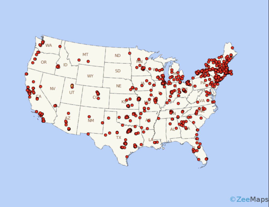
This map shows Starbucks locations in the northeastern United States. One dot represents one store. Areas with closely concentrated dots have a large number of stores, while areas without any red dots have no stores. This map was created using ZeeMaps.
Limitations of Dot Density Maps
While dot density maps are a great tool for clear, simple maps to visualize complex data sets, they aren’t the best for all data sets. Here are some of the limitations and cons of using this type of thematic map.
For one, using the map in reverse – as in, discerning precise numerical information or pulling out a specific data point can be challenging, particularly in densely populated areas.
Additionally, dot density maps must be constructed carefully to avoid distorting the date. They should be drawn on equal area map projections, and not combined with other types of maps that intentionally distort areas, such as cartogram maps. Map creators should carefully consider the placement of dots to avoid implying anything incorrect.
How to Create Your Own
You can create your own dot density map using ZeeMaps or other map creation tools. All you need is a dataset for the variables you want to measure and a ZeeMaps account. Follow the steps below to start mapping.
- Define Objectives: First, you should clearly outline the objectives of your map to guide the data selection and visualization process.
- Gather and Select Data: Choose datasets that can be effectively represented using this type of mapping and align with your objectives. If you’re creating the map for business purposes, it’s helpful to get accurate data from your sales or insights team.
- Upload the Dataset to ZeeMaps: After you’ve created your account, click “Additions,” then “Upload (Copy/Paste) Spreadsheet.” Upload your data file, and then make sure all the parameters are correct.
- Customize Your Map: Experiment with dot size and value to strike the right balance between clarity and visual appeal. You can use varying colors to show different regions or distinguish between values somehow.
- Share Your Creation: Use the sharing tools to show off your map on a website, social media, or presentation.
In conclusion, dot density maps offer a compelling way to visualize density variations across geographical distributions. With their simplicity, flexibility, and intuitive appeal, they can be valuable tools for businesses, researchers, and policymakers. By leveraging their capabilities, organizations can gain profound insights into spatial patterns, make informed decisions, and drive impactful change.
Inspired by this map?
Create your own interactive map with ZeeMaps in minutes.