A spreadsheet full of numbers rarely tells a story. A color map by data values tells it instantly.
With ZeeMaps’ new data-driven coloring, you can shade pins and regions using a graduated color scale, making high-value and low-value areas stand out at a glance.
Whether you’re mapping sales by store, members by county, donations by state, or income by ZIP code, color-coding by value transforms a plain spreadsheet into a clear, professional map that anyone can understand in seconds.
What Is Data-Driven Coloring?
Instead of displaying every location in the same color, ZeeMaps can automatically color each pin or region according to the value of a data field. Higher values receive darker, more intense colors, while lower values receive lighter shades.
Data-driven coloring works in two ways:
Pins
Each map marker is colored according to its value. Instantly spot your highest-performing locations, largest customers, busiest facilities, or most active members.
Examples:
- Store locations colored by revenue
- Customers colored by order size
- Facilities colored by capacity
- Members colored by participation level
Regions
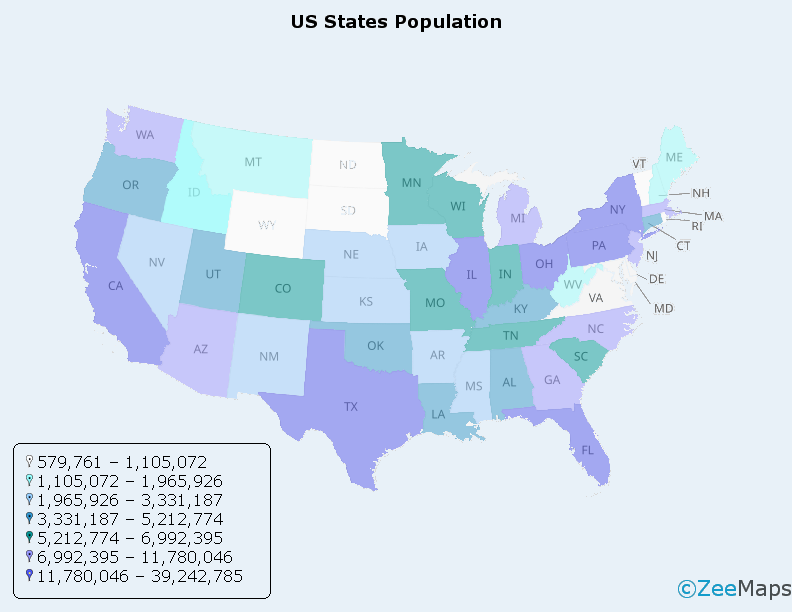
ZIP codes, counties, and states can be shaded according to their values. This type of visualization is commonly known as a choropleth map, for example see.
Examples:
- Counties colored by membership count
- States colored by donations received
- ZIP codes colored by median income
- Territories colored by sales performance
Either way, you get an immediate visual picture of where your numbers are concentrated—ideal for sales territories, demographics, memberships, fundraising, service coverage, and performance analysis.
How to Color Map by Data Value
Data-driven coloring is configured during spreadsheet import or synchronization.
- Upload a spreadsheet or connect a cloud-based spreadsheet to your ZeeMaps map.
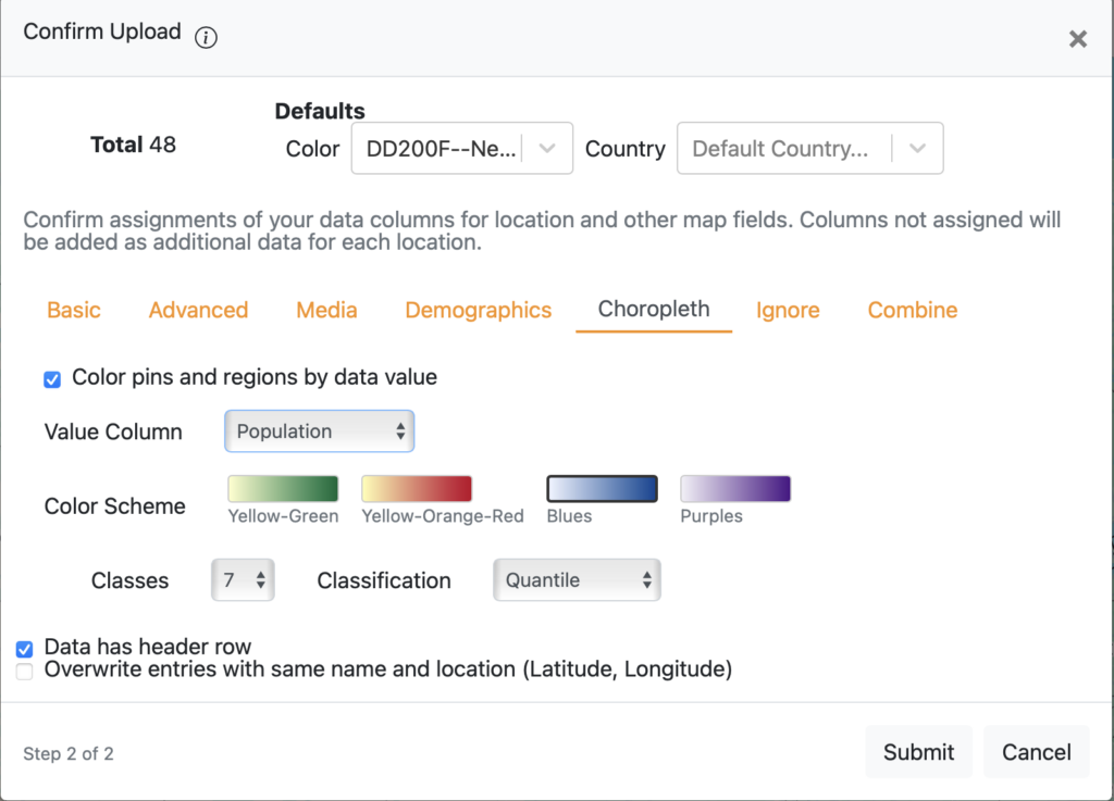
- Open the Choropleth tab in the import dialog.
- Enable Color pins and regions by data value.
- Select a Value Column containing the numbers you want to visualize (revenue, count, percentage, population, and so on).
- Choose a Color Scheme, Number of Classes, and Classification Method.
- Complete the import.
ZeeMaps automatically colors every pin or region according to its value.
If your map is connected to a cloud spreadsheet, colors will automatically update whenever ZeeMaps refreshes the underlying data.
No Data of Your Own? Use Census Demographics
For region maps, you don’t even need to supply your own numeric data.
The Value Column menu also includes built-in U.S. Census demographic data for ZIP codes, counties, and states.
For example, you can color regions by:
- Population
- Median household income
- Housing values
- Educational attainment
- Other Census metrics
Want to shade every county by population or every ZIP code by median household income? Simply select the demographic field and ZeeMaps handles the rest.
This makes it easy to add valuable context to your existing maps or identify promising new markets.
Choosing Colors and Classes
A good thematic map depends on clear, readable colors.
ZeeMaps provides simple controls that help produce professional-looking maps:
Color Schemes
Choose from four cartographer-friendly color gradients:
- Yellow-Green
- Yellow-Orange-Red
- Blues
- Purples
Each progresses from light shades for lower values to darker shades for higher values.
Classes
Data can be grouped into either:
- 5 classes for a cleaner, easier-to-read map
- 7 classes for greater detail and finer distinctions
Classification Methods
ZeeMaps currently supports two classification methods:
Quantile
Each color category contains roughly the same number of locations. This creates a visually balanced map and works well when your values are unevenly distributed.
Equal Interval
The full value range is divided into equal-sized intervals. This method is useful when specific numeric thresholds matter and you want equal steps between categories.
As a general rule:
- Choose Quantile for exploratory analysis and balanced visualizations.
- Choose Equal Interval when comparing values against meaningful numeric ranges.
Works with Your Existing Maps
Data-driven coloring integrates seamlessly with other ZeeMaps features.
- Works with both pin maps and region maps.
- Supports ZIP code, county, and state region maps.
- Works alongside Map Layers to color an entire map or individual layers.
- Pairs naturally with Region Labels and U.S. Census Demographics for richer visualizations.
Related articles:
Final Thoughts
Data-driven coloring turns numbers into insight.
Instead of explaining where your strongest markets, busiest regions, or biggest opportunities are located, you can simply show them.
Choose a value, select a color scheme, and let the map do the work. The moment your data is imported, patterns become visible that might otherwise remain hidden in a spreadsheet.
Try data-driven coloring on your next ZeeMaps import and see how quickly your data comes to life.